From start to finish
A postcard design starts with a survey submitted by the client describing what they are looking for, ranging from offers, colors, design style, and any other pertinent information to the design. The design goes to copy and then it’s sent to us designers. From there, we base everything off of the survey as well as their website, if they don’t have a pre-existing website, we get to design it however we want. From everything as simple as fonts and colors, we get to create a fully branded design that we think will best suit the company. Oftentimes, my original designs have been used to design the client a website as well.
Every design is built from the ground up using stock images or illustrations to best convey the vibe of the company. I’ve found that photo choice, fonts and colors make the biggest difference when its comes to building a unique card for the customer. Every postcard shown in my portfolio was designed to completion within an hour to three hour range, depending on how in depth the client’s standards are.
Corporate Postcard Design
A lot of the postcard designs shown on the previous page follow my current marketing companies’ design standards to a tee: Because of this, there are a few common themes that I wouldn’t have chosen for certain styles of design. One major one being corporate design. Most corporate design is simple, minimal with copy and the image is the storyteller of the design. With that in mind, I made a couple changes to one of my favorites that I have done to better fit the styling indicative of modern corporate design.

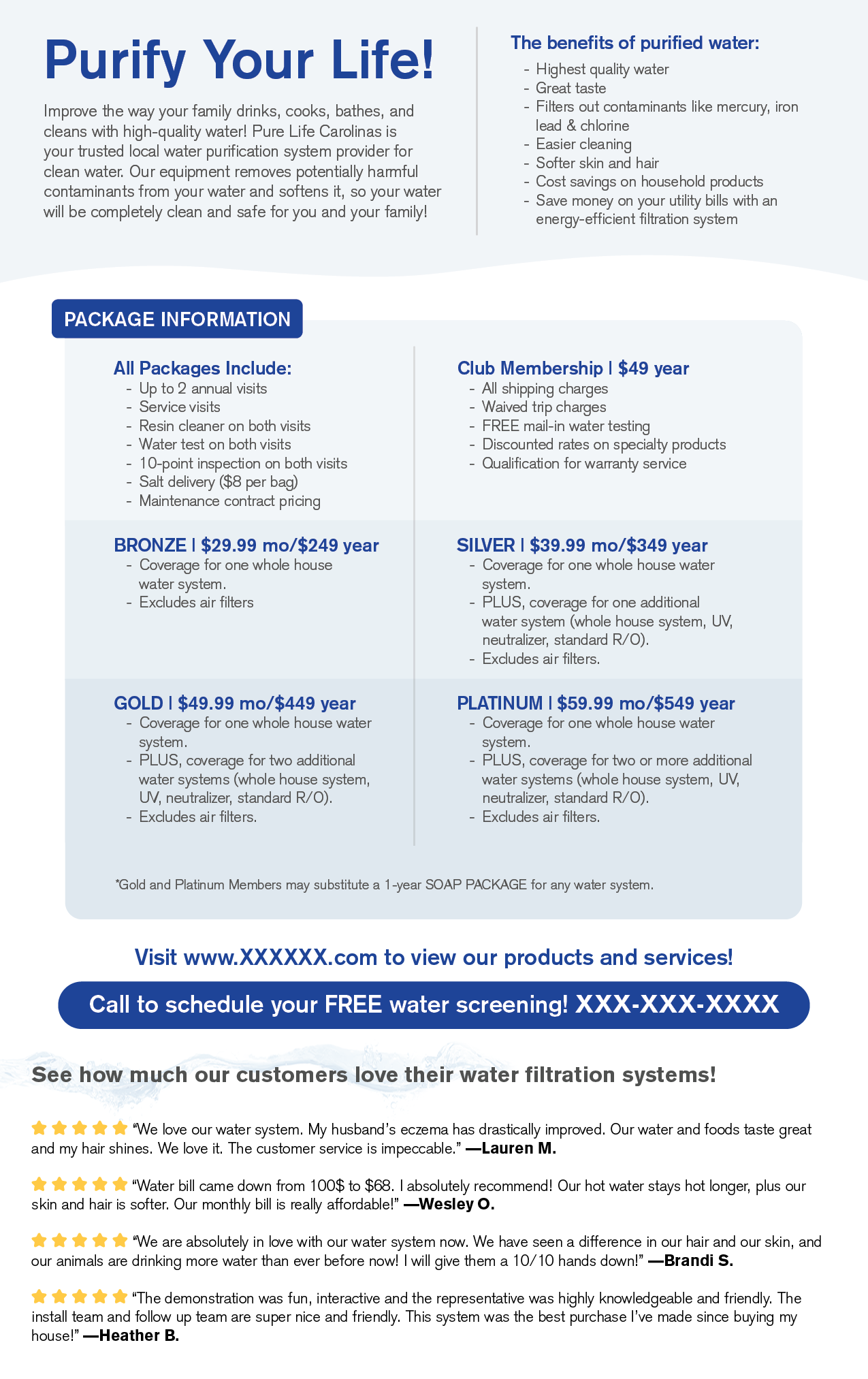
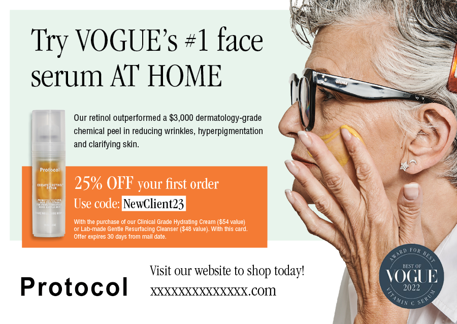
Following job standards
This is a corporate style postcard design that I did while upholding the standard given to me by my company. It’s copy heavy and does a little too much when keeping the product and its’ branding in mind.

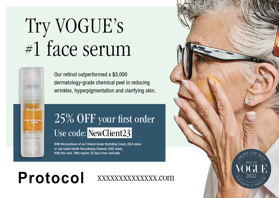
Improvements
Without changing too much of the copy, there were a few things to be done to better suit the luxury feeling of this card. Opting for a more subtle dark blue over the abrasive orange in the offer space helps with hierarchy and flow between elements. Getting rid of the call to action above the website as well as a few words in the headline help the design breath now that there’s a bit more negative space. The product image is larger and more apparent now that the orange block is gone.
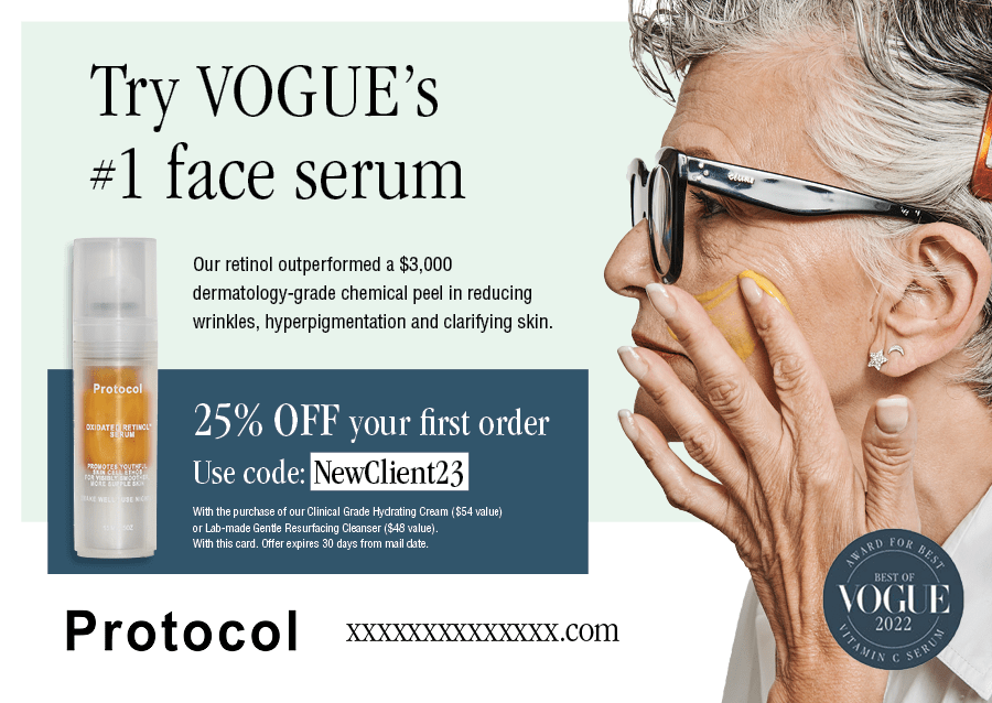
Side by side