How it became Klines
Without a name
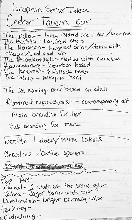
I knew from the beginning that my senior thesis would revolve around artists’ culture, it was just a matter of figuring out how and in what way. The first big step was the name. Klines took a LONG time before it was properly named after the famous abstract painter Franz Kline.
It was originally named “Blank Canvas” and was meant to cater to a wider range of people. The name “Klines” came into play when I decided I wanted the bar to have an unforgiving and unwelcoming atmosphere and brand. Franz Kline was known for constantly getting into fights with fellow artists about what was truly “good art” which is why I eventually named the brand after him.
I had created a few assets for the brand before the name had been chosen. These included drink icons (originally meant to be used specifically for different kinds of drinks) which eventually made their way into the logo and the drink menu. Along with these icons, I had workshopped a bunch of drink names named after famous artists of the time and what kind of drink fit their personalities the best.


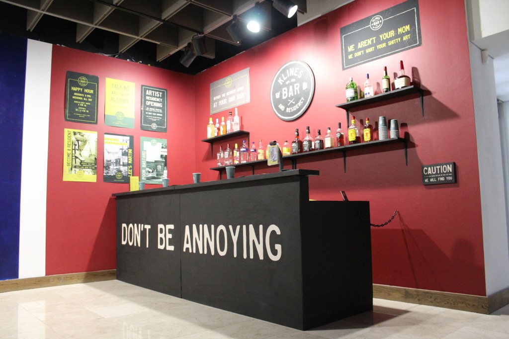
Logo
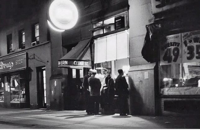
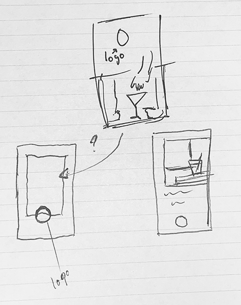
Once the name was established, I had to rethink the styling of what “Klines” needed to look like and the first step was the logo. Instead of the typical “artsy vibe”, I wanted to go more into a dive bar theme that was reminiscent of the Cedar Tavern; which was known as being an artist haven during the era of abstraction in art. Based on research, I found that most bars, including the Cedar Tavern, have circular logos with the word “Bar” being the most prominent.
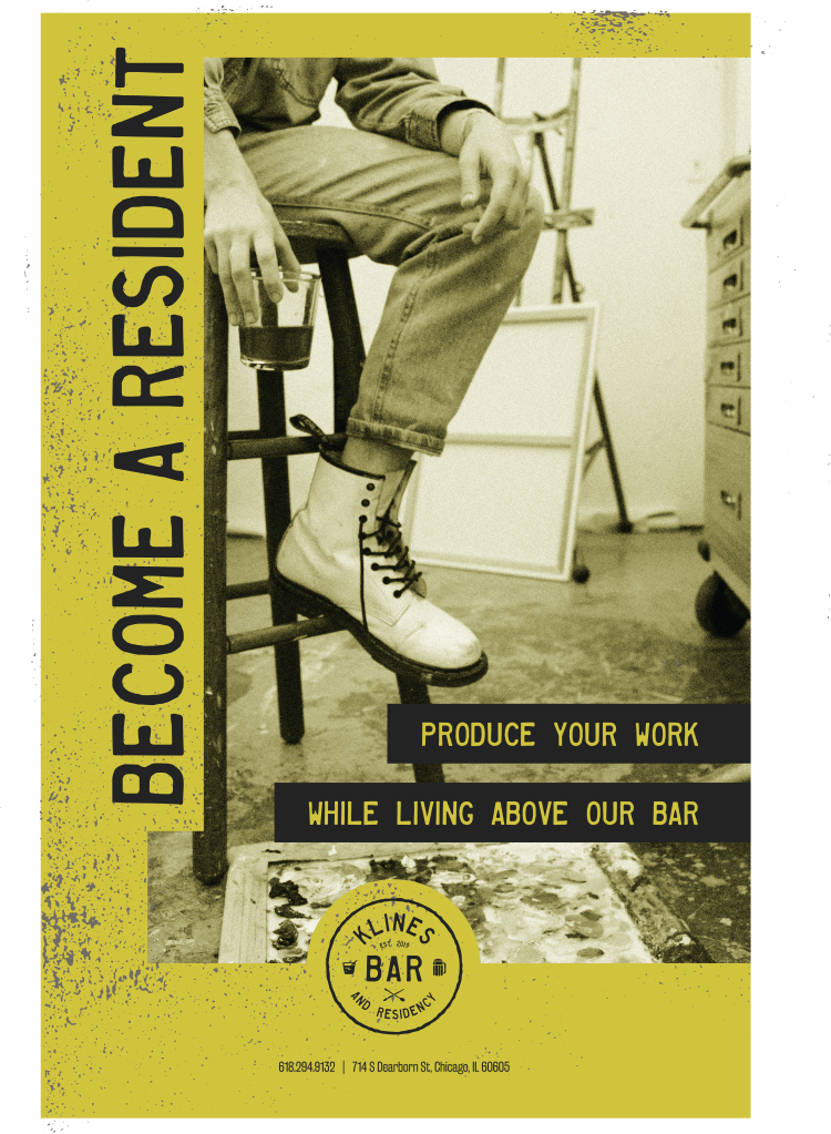
After a little refinement and the help of a few icons that were illustrated before the name change, the final version of the Klines logo was created. The font and icons used have a distressed appearance that was meant to reinforce the abrasive nature of the bar and its patrons. The logo was specifically designed to be placed on a circular placard outside the bar, as well as behind the bar inside.
Brand style
From the very beginning of the conceptualization of Klines, I knew that the branding needed to be simple and to the point. The people who would be interested in coming in don’t have the time or energy to read a text heavy poster outside of a bar. The colors that were chosen are diverse enough for contrast, but not so much so that more than three of the brand colors could go together on one design. A majority of the designs had an apparent call to action and a little bit of information as to what the bar was about.

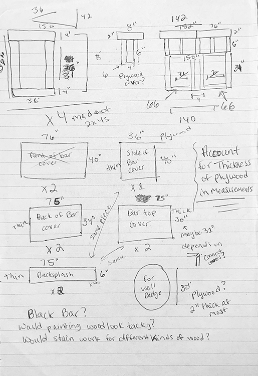
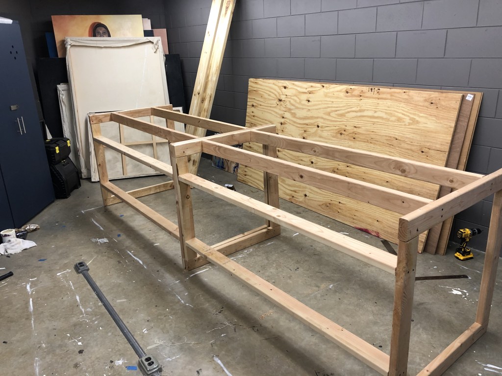
Building the bar
As soon as I decided on a bar for my brand, I was immediately drawn to the idea of building a bar from scratch. Building a bar reinforced the idea of artists doing whatever they want to fully pursue their vision; a certain hard-headedness that fit the vibe of Klines (I also just wanted to see if it was something I could actually achieve).